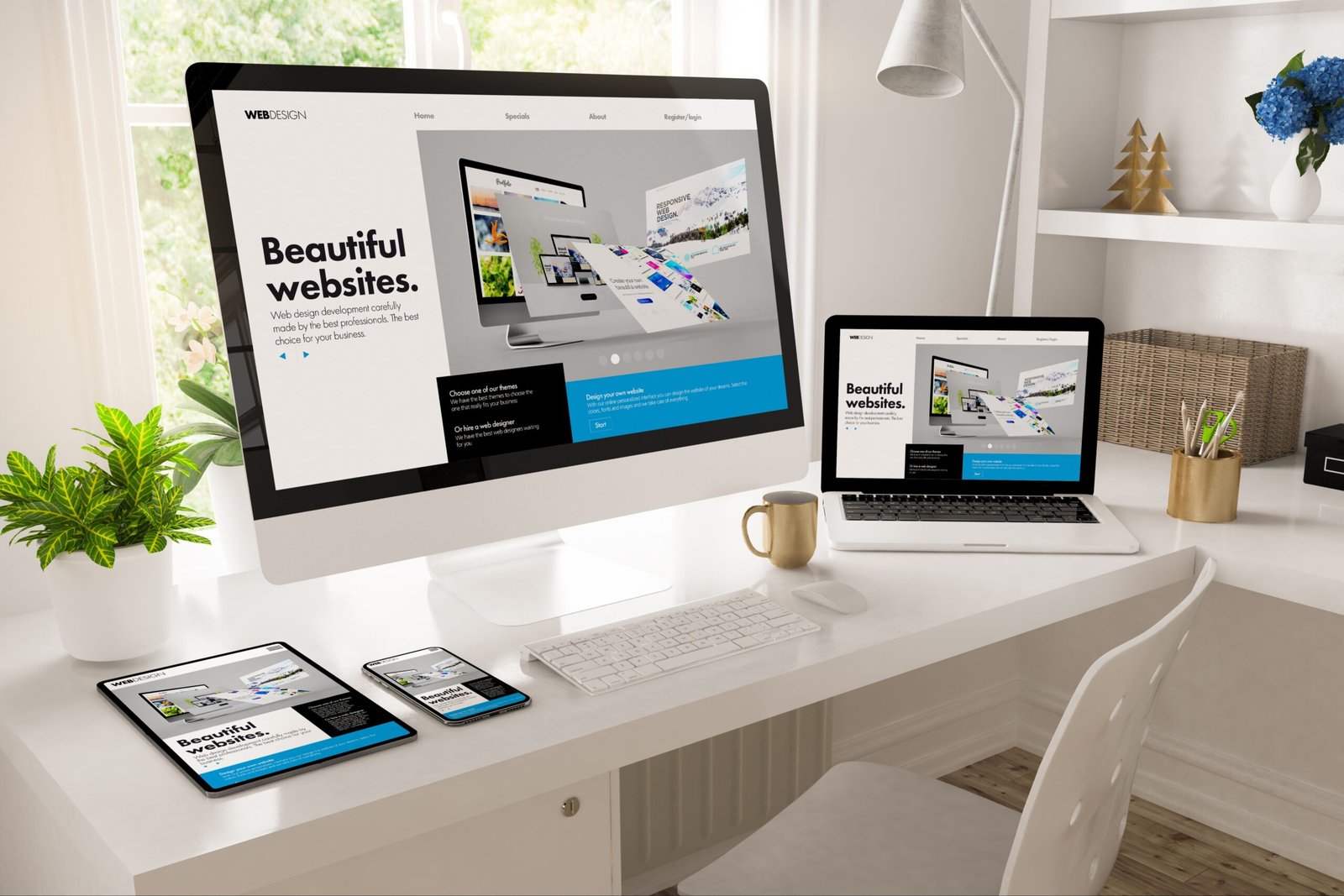
A simple website doesn’t mean a boring one. In fact, keeping your website clean and focused is one of the best ways to make a strong impression online. Whether you’re a small business owner, a freelancer, or just getting started with your personal brand, having a simple and effective website can help you build trust, attract visitors, and turn them into customers.
Why Simplicity Matters
People don’t visit your website to admire flashy animations or scroll through endless features. They come to find something—information, a service, a product, or a way to contact you. If your site is hard to navigate or too cluttered, most visitors will leave within seconds.
A simple website:
- Loads faster
- Is easier to use on any device
- Looks clean and professional
- Helps people find what they need quickly
- Keeps the focus on your message or offer
Simplicity also builds trust. A well-organised, clutter-free site makes your business look more professional and easier to work with.
1. Start with a Clear Goal
Every website should have a main goal. Are you trying to get people to contact you? Book a service? Download something? Sign up for a newsletter?
Start by asking yourself:
- What is the one thing I want visitors to do when they land on my site?
- What do I want them to remember about my brand?
Once you’re clear on your goal, you can design everything else around it. A website without a clear purpose often ends up feeling confusing or unfocused.
2. Use a Clean Layout
A good layout is the backbone of a simple website. It should guide visitors from section to section with ease. Stick to a clear structure with enough white space (empty space) between elements. This helps people read and understand your content better.
Tips for a clean layout:
- Use a simple grid or column-based design
- Avoid placing too much text or images in one section
- Keep each section focused on one message or purpose
- Make sure the most important information appears near the top
You don’t need to fill every corner of the screen. Give your content room to breathe.
3. Keep Navigation Simple
If people can’t find what they’re looking for, they’ll leave your site. Simple navigation means fewer clicks, clear labels, and no hidden pages.
Here’s what to keep in mind:
- Limit your main menu to 4–6 items
- Use clear labels like “Home,” “About,” “Services,” “Portfolio,” and “Contact”
- Make sure every page is easy to reach from the main menu
- Use a sticky or fixed menu so it’s always visible
Also, include clear calls to action like “Get in Touch,” “View Services,” or “Start a Project” to help guide users.
4. Focus on Content That Matters
You don’t need a lot of words—just the right ones. Keep your content short, helpful, and focused on your audience. Every sentence should serve a purpose.
Tips for writing simple website content:
- Use short sentences and paragraphs
- Avoid jargon or complicated words
- Break up text with bullet points or headings
- Answer common questions your visitors may have
- Write for your audience, not yourself
Most people scan content, so make it easy to read. Highlight key points and use bold text sparingly to draw attention.
5. Choose a Simple Colour Scheme
Too many colours can make a website look messy or unprofessional. Stick to 2–3 main colours that match your brand. Use contrast wisely—dark text on a light background is easiest to read.
Make sure buttons, links, and headings are consistent in colour and style. This helps visitors quickly understand how your site works.
6. Use High-Quality Images (But Not Too Many)
Images make your site more engaging, but using too many can slow down loading time and distract from your message.
Here’s how to keep it effective:
- Use only high-quality images that support your content
- Avoid using stock images that feel generic or overused
- Compress images for fast loading
- Use the same style or filter to keep things consistent
If possible, use original images that reflect your business, workspace, or products.
7. Make It Mobile-Friendly
More than half of all website traffic comes from mobile devices. That means your website must work well on smaller screens.
To keep your website mobile-friendly:
- Use responsive design so it adjusts to any screen size
- Test your layout on phones and tablets
- Make sure text is readable without zooming in
- Keep buttons large enough to tap easily
If your website doesn’t work on mobile, you’re losing potential visitors.
8. Optimise for Speed
A slow website is frustrating. Even if your design is simple, large files or too many features can make it load slowly. And that can hurt both your user experience and search engine rankings.
Speed tips:
- Compress images before uploading
- Limit the use of animations or third-party scripts
- Choose a good hosting provider
- Use caching tools to improve load time
Fast sites feel easier to use and leave a better impression.
Final Thoughts
A simple and effective website isn’t about doing less—it’s about doing the right things well. When your layout is clean, your message is clear, and everything works smoothly, your visitors are more likely to trust you and take action.
You don’t need to add everything at once. Start small, keep things focused, and make improvements over time.
If you’re planning to build a website or refresh your current one, focus on simplicity first. It’s the best way to create something that not only looks good—but works well, too.


